
Our first task you might ask... Well you may have noticed we are learning text styles and writing.... this of course leads to non other than..........MOVIE POSTERS. Yes we get to either recreate or remake a movie poster. The stipulation... it must be an existing movie. No it has to be from 2010, it can't have this, it can't have that, it has to follow your theme. This is one of the best one's we have gotten it is almost entirely whatever we would like to do especially if it is a recreate in which case it has to capture the feel of the movie but does not have to look like the existing posters. PERFECT right. This is where the creativity flows. So you may ask me what am I doing for my poster, well I'll give you a hint, it does have to do with my theme.
It is none other than HERCULES

That's right the place where the song "I need a hero" became popular.
As for text styles, I found one that I had done last year as well as made a few new ones up while working on a fake movie poster for an inclass assignment and I thought I would share them with you here.

Now the water one (my favourite) can also be used to look like glass depending on the font you use and what you lie it on. To accomplish this style type what you like or add droplets, I personally did my font first and then added the drops later and put the style on both layers,
From there you will go into your layer style box
Put the drop shadow to the following pictures specifications


If you follow those instructions you can get the water look. As well a little side not if you would like to put water droplets on that blend into your text layer, rasterize your text layer and then add the water droplets with a brush, in varying sizes or with the brush set to scatter, which you can find in the brush panel. After doing that if you have not already put the layer style on put it on then and you will get the water droplets that blend in to the word like real water would.
As for the luxury word the settings are:


*As a note this one does not really look well with the text colour as white, any other colour and the text looks transparent*
And Lastly the pearls under the word luxury
I started with a brush with the colour white.


If you have any trouble following these, please let me know and I will try and help you.
Now for the last thing that I did this week.
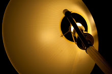
We had a nice fun class on Friday where we learned about dragging our shutter. Here are just a few of the images me and my group got with sparklers and glow sticks.


These are just a few of the many fun images we took during that class. It was one awesome time and I would do it again in a heart beat. If you ever get a chance to do this.. I recommend you do.
Have a camera, have a tripod, got some sparklers and glow sticks. Find a dark space and do it on your own or with friends. We ended up spelling all our names out after realizing you had to write backwards, we made a person, we light our entire set with the sparklers only. It was awesome.
Do something creative this week, you'll feel better.
Sincerely,
-Photo Alley
No comments:
Post a Comment